

Hey again! In the previous blog, I guided you through automatically generating our interface for the to-do app. This time, I'll provide a step-by-step tutorial on changing our default theme to TailwindCSS.
Changing our default theme file directory
First, in our public folder, create a theme folder.
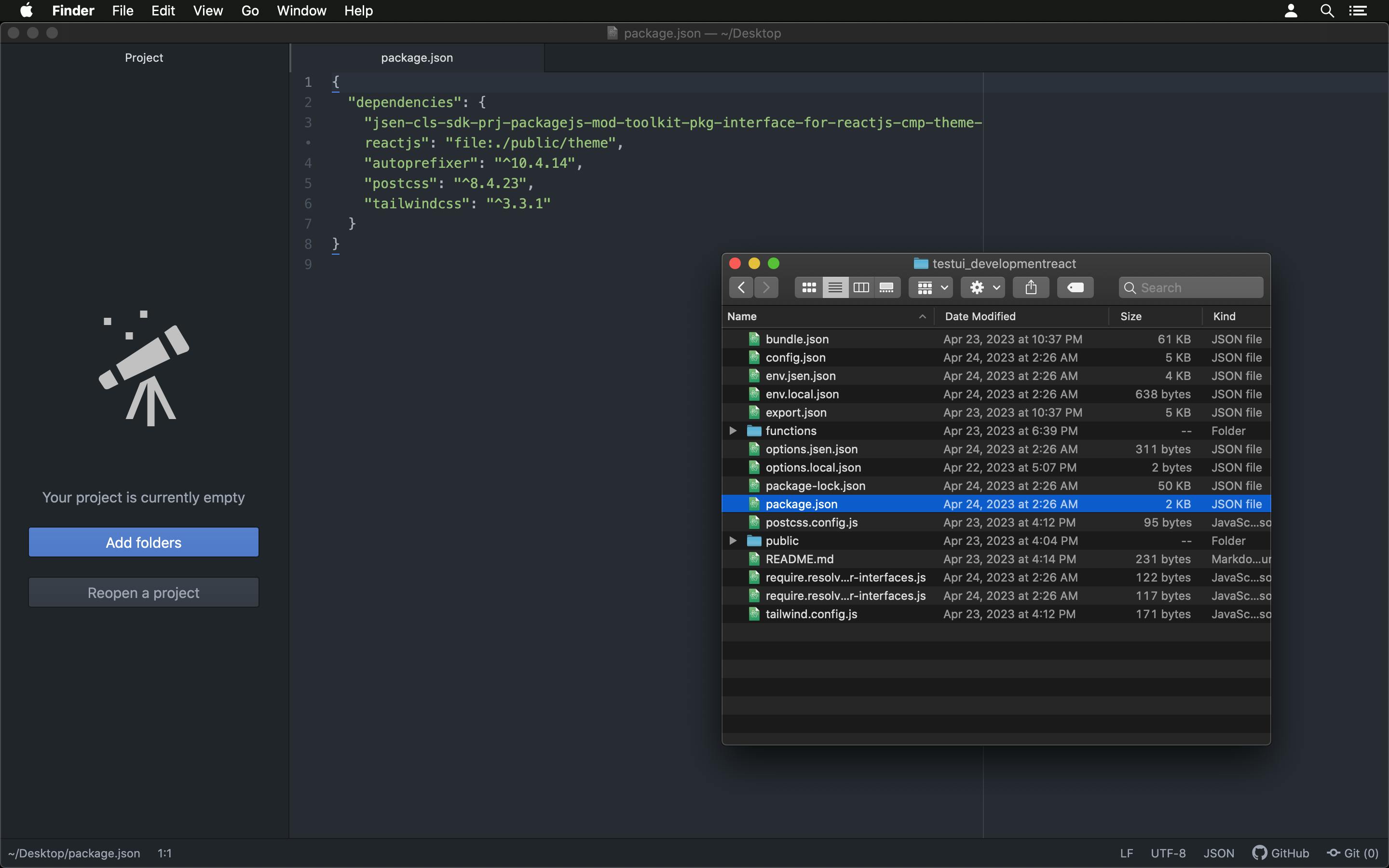
Then at the root of our to-do-interface_development folder, open the package.json file.
Look for this section:
"dependencies": {
    "cmpa-d3339e7f6947f2996be9f5febf377c6f": "file:/home/richgod/PackageJS/Practice/unstyled/to-do-interface_development/functions/patch",
    "cmpa-d7ee2cbe945359db670491f7c6fbb295": "file:/home/richgod/PackageJS/Practice/unstyled/to-do-interface_development/functions/delete",
    "cmpa-d4885ad408d784cb9d6bcd08fea11cab": "file:/home/richgod/PackageJS/Practice/unstyled/to-do-interface_development/functions/post",
    "cmpi-d386af6ac3a67aa1bb534e90c861336a": "file:/home/richgod/PackageJS/Practice/unstyled/to-do-interface_development/functions/item",
    "cmpl-dc13c9bea8f074cb0fe2a7e353024dc7": "file:/home/richgod/PackageJS/Practice/unstyled/to-do-interface_development/functions/todos",
    "cmpr-d95529c47903cbc3cb36a703bd774f77": "file:/home/richgod/PackageJS/Practice/unstyled/to-do-interface_development/functions/root",
    "jsen-cls-sdk-prj-packagejs-fnc-deploy-ui-on-unix-nodejs": "git+http://localhost:49418/Repositories/packagejs-repository/jsen-cls-sdk-prj-packagejs-fnc-deploy-ui-on-unix-nodejs/1.0.0-14.18.2-compiled.git",
    "jsen-sym-bundle-sdk-for-interfaces": "git+http://localhost:49418/Projects/jsen-project/jsen-cls-sdk-mod-bundle-pkg-interface-for-reactjs-without-builder-on-localhost-use-vite-react-nodejs/1.0.0-14.18.2-compiled.git",
    "jsen-sym-bundle-app-for-interfaces": "git+http://localhost:49418/Projects/jsen-project/jsen-cls-sdk-mod-bundle-pkg-interface-for-reactjs-via-app-basic-ecmascript/18.2.0-6.0.0-compiled.git",
    "jsen-cls-sdk-prj-packagejs-mod-toolkit-pkg-interface-for-reactjs-cmp-state-reactjs": "git+http://localhost:49418/Repositories/packagejs-repository/jsen-cls-sdk-prj-packagejs-mod-toolkit-pkg-interface-for-reactjs-cmp-state-reactjs/1.0.0-18.2.0-compiled.git",
    "jsen-cls-sdk-prj-packagejs-mod-toolkit-pkg-interface-for-reactjs-cmp-theme-reactjs": "git+http://localhost:49418/Repositories/packagejs-repository/jsen-cls-sdk-prj-packagejs-mod-toolkit-pkg-interface-for-reactjs-cmp-theme-reactjs/1.0.0-18.2.0-compiled.git"
  }
Then in the last line where the key theme key value is:
"git+http://localhost:49418/Repositories/packagejs-repository/jsen-cls-sdk-prj-packagejs-mod-toolkit-pkg-interface-for-reactjs-cmp-theme-reactjs/1.0.0-18.2.0-compiled.git"
Change it to the file path that points to the public/theme directory you created earlier, and it will look like this:
"file:./public/theme"
Now you've done all that, it's time to install TailwindCSS.
Installing TailwindCSS
Now, add these to our dependencies in our package.json file:
{
    "dependencies": {
        "jsen-cls-sdk-prj-packagejs-mod-toolkit-pkg-interface-for-reactjs-cmp-theme-reactjs": "file:./public/theme",
        "autoprefixer": "^10.4.14",
        "postcss": "^8.4.23",
        "tailwindcss": "3.3.1"
    }
}
After doing that, make sure we're connected to the internet and run npm install in our terminal to install those dependencies you just added.
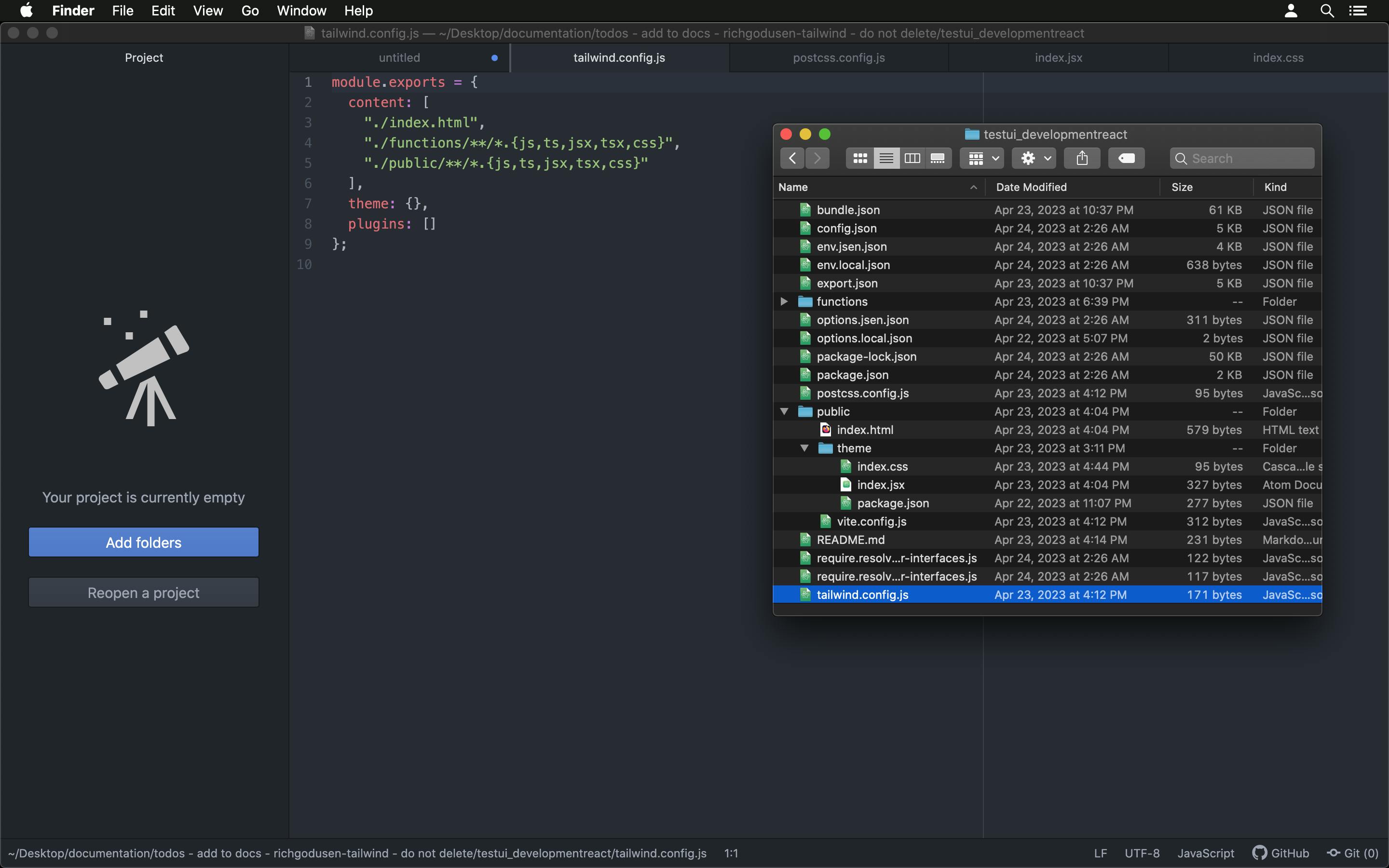
Next, we'll add these to our tailwind.config.js file:
module.exports = {
    content: [
        "./index.html",
        "./functions/**/*.{js,ts,jsx,tsx,css}",
        "./public/**/*.{js,ts,jsx,tsx,css}"
    ],
    theme: {},
    plugins: []
};
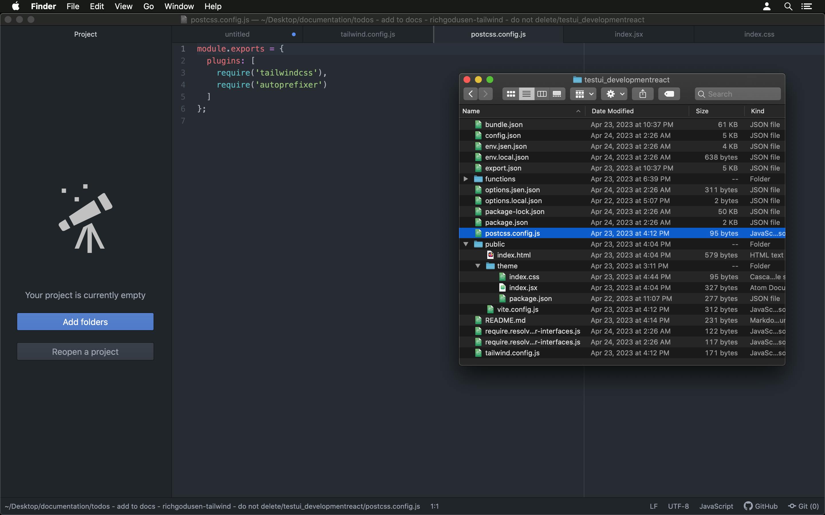
And then create a new file in the root directory called postcss.config.js and type these in:
module.exports = {
    plugins: [
        require('tailwindcss'),
        require('autoprefixer')
    ]
};
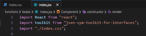
Inside our theme folder, create an index.jsx file and type these in:
import React from "react";
import "./index.css";
const Component = function (...args) {
    React.Component.call(this, ...args);
    this.render = function () {
        return (<></>);
    };
    return;
};
Component.prototype = Object.create(React.Component.prototype);
Component.prototype.constructor = Component;
export default Component;

In that same folder, create an index.css file and type these in:
@import "tailwindcss/base";
@import "tailwindcss/components";
@import "tailwindcss/utilities";

The last file we need to create in our theme folder is package.json. And, in there, we'll type these in:
{
  "name": "jsen-cls-sdk-prj-packagejs-mod-toolkit-pkg-interface-for-reactjs-cmp-theme-reactjs",
  "description": "",
  "version": "0.0.0",
  "author": {
    "name": "unlicensed"
  },
  "license": "UNLICENSED",
  "private": true,
  "main": "index.jsx",
  "dependencies": {}
}
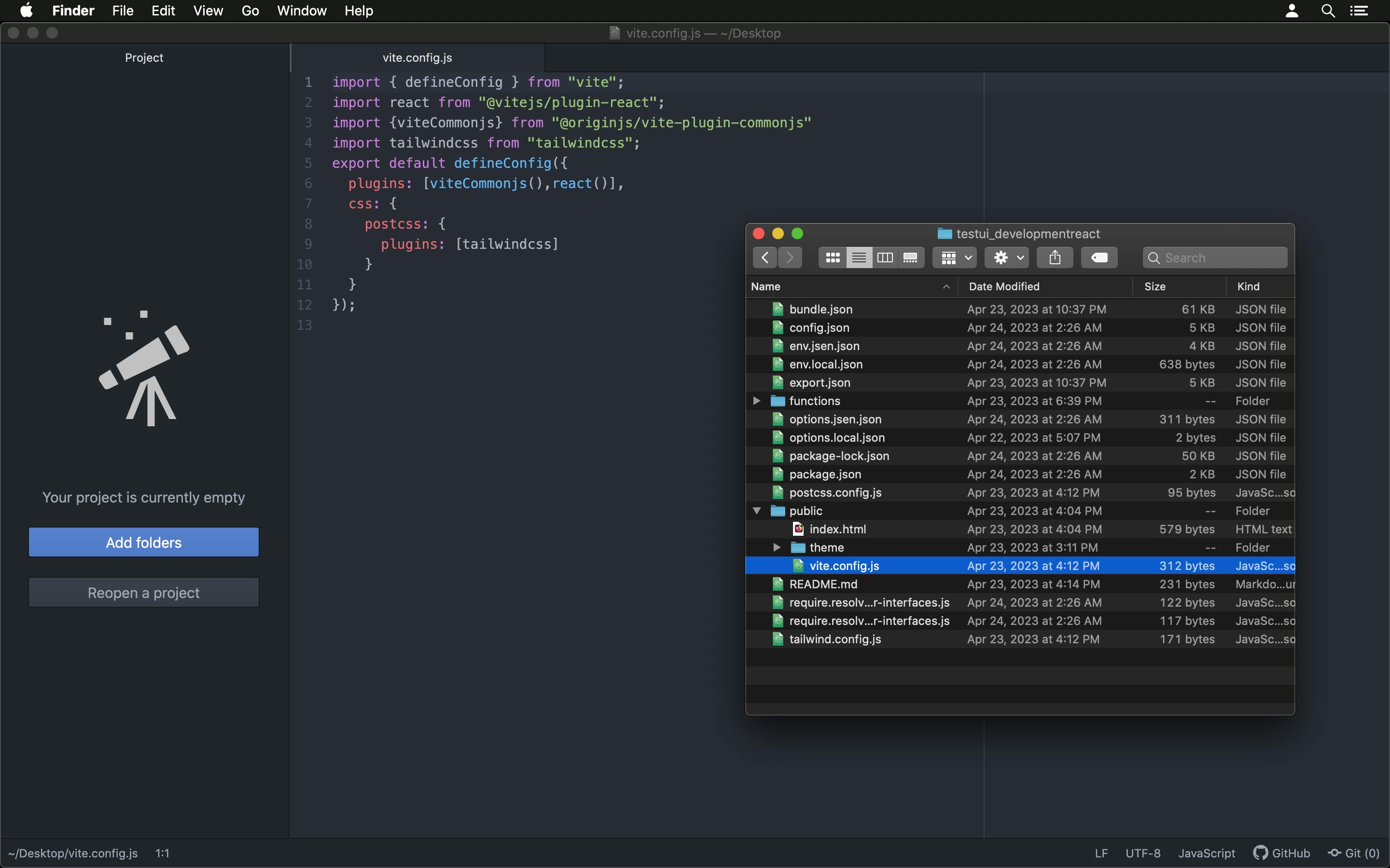
Lastly, at the root of our public folder, create a vite.config.js file and type these in:
import { defineConfig } from "vite";
import react from "@vitejs/plugin-react";
import { viteCommonjs } from "@originjs/vite-plugin-commonjs";
import tailwindcss from "tailwindcss";

export default defineConfig({
    plugins: [viteCommonjs(), react()],
    css: {
        postcss: {
            plugins: [tailwindcss]
        }
    }
});
Styling a component
If you've followed the steps above properly, once you restart the interface server, it will look like this:

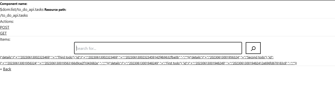
Now that we've added TailwindCSS to the PackageJS interface folder, it's time to add some Tailwind classes to the UI. But first, we'll need to update our interface in the PackageJS dashboard to use custom components (instead of the default interface components that are automatically generated).

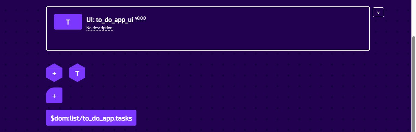
For the custom component, we'll add the list component. To do that, click on that highlighted plus sign and choose Standard component.

Then set the connection path to $dom:list/to_do_app.tasks and click Next.

After that, set the Default component to Local file absolute path (file:).
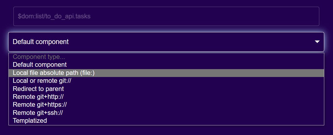
And in the textarea with the placeholder Absolute path or URL to component file or package..., type in your desired path name for our component, and click Insert:

There! We've created our component:
Now, we'll export our interface, extract its contents, and update the interface project folder with the new files (make sure you stop the interface server first!).
CAREFUL! If you just copy and paste the package.json from the newly exported update folder into the original interface folder, we'll overwrite the tailwind dependencies you added. So we'll have to copy-paste the key-values for the:
theme
tailwind
postcss
autoprefixer
into the new package.json file, and THEN drag it into the new original interface project folder.

Now that we've updated the interface project folder, it's time to redeploy the interface (npm install, then npm run deploy).

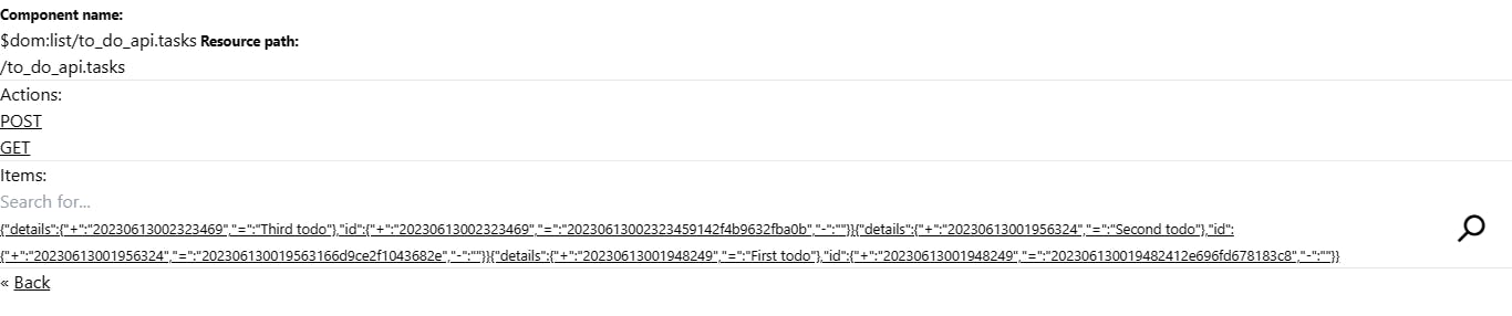
We'll refresh the browser window and see that everything is the same, except, now we can actually edit the list component page!
On the list component page, there is HTML for the default search component that's on the page. To style that search bar (input and button), all we have to do is wrap the component with a <div></div>, and give it this TailwindCSS styling, like so:
We can also use Vanilla CSS to style our component if we want. First, we'll give the <div></div> wrapping our component a className that we'll reference, like customSearchComponentWrapper:
Then create an index.css file in the todos folder:

We have to be sure that we've imported our index.css file like so:
Then we'll add these styles to the index.css file we just created:
.customSearchComponentWrapper input {
    width: 50% !important;
    height: 3rem !important;

    padding: 0.5rem !important;
}

.customSearchComponentWrapper input,
.customSearchComponentWrapper button {
    margin-left: 0.5rem !important;
    margin-right: 0.5rem !important;

    border: 2px solid black !important;
}

.customSearchComponentWrapper button {
    height: 3rem !important;
    position: relative !important;
    padding: 0.5rem !important;
    font-size: 2rem !important;
}

.customSearchComponentWrapper form {
    width: 100% !important;
    display: flex !important;
}

.customSearchComponentWrapper form div {
    width: 100% !important;
    display: flex !important;
    align-items: center !important;
    justify-content: center !important;
}
The next time we take a look at our To-do app in the browser, our search component should look like this:
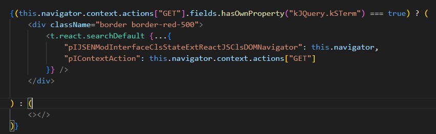
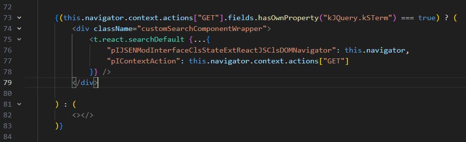
Here is the code for the entire custom list component, in case you want to copy-paste everything:
import React from "react";
import toolkit from "jsen-sym-toolkit-for-interfaces";
import "./index.css";
const t = toolkit;
const Component = function (
...args
) {
React.Component.call(this, ...args);
t.cmp.listDefault(this);
this.componentDidMount = async function () {
await this.ma_mounted_default();
};
this.componentWillUnmount = async function () {
await this.ma_unmount_default();
};
this.render = function () {
let items = this.navigator.context.items.reduce((o, v) => {
if (v.attributes[v.contract["kSPrimary"]].hasOwnProperty("-") !== true
|| v.attributes[v.contract["kSPrimary"]]["-"] === ""
|| v.attributes[v.contract["kSPrimary"]]["-"] === "0") {
o.push(v);
}
return o;
}, []);
return (<div>
<main>
<p>
<small><strong>Component name:</strong></small>
<br />
<input
value={this.navigator.context.name}
type="text"
className="readonly"
readOnly
/>
<small><strong>Resource path:</strong></small>
<br />
<input
value={this.navigator.dom.constructor.fs_build_context_path(this.navigator.context)}
type="text"
className="readonly"
readOnly
/>
</p>
<hr />
{Object.keys(this.navigator.context.actions).length > 0 ? (
<div>
<h3>Actions:</h3>
{Object.keys(this.navigator.context.actions).map((k, i) => {
return (<p key={"actions-" + k}>
<a
onClick={((e) => { this.ma_go(e, this.navigator.context.actions[k]).catch(() => { }); })}
href={"#" + k}
><u>{k}</u></a>
</p>);
})}
<hr />
</div>
) : (
<></>
)}
{(this.navigator.context.actions.hasOwnProperty("GET")) ? (
<div>
<h3>Items:</h3>
{(this.navigator.context.actions["GET"].fields.hasOwnProperty("kJQuery.kSTerm") === true) ? (
<div className="customSearchComponentWrapper">
<t.react.searchDefault {...{
"pIJSENModInterfaceClsStateExtReactJSClsDOMNavigator": this.navigator,
"pIContextAction": this.navigator.context.actions["GET"]
}} />
</div>
) : (
<></>
)}
{items.length > 0 ? (
<div>
{items.map((v, i) => {
return (<small key={"items-" + i}>
{v.contract["kSRoute"].length ? (
<a
onClick={((e) => { this.ma_go(e, v).catch(() => { }); })}
href={"./" + encodeURIComponent(v.attributes[v.contract["kSPrimary"]]["="]) + "/"}
><u>{JSON.stringify(v.attributes)}</u></a>
) : (
<span>{JSON.stringify(v.attributes)}</span>
)}
</small>);
})}
</div>
) : (
<small><em>Nothing here yet...</em></small>
)}
{(this.navigator.context.actions["GET"].fields.hasOwnProperty("kJQuery.kSTerm") === true) ? (
<t.react.searchLoadmore {...{
"pIJSENModInterfaceClsStateExtReactJSClsDOMNavigator": this.navigator,
"pIContextAction": this.navigator.context.actions["GET"]
}} />
) : (
<></>
)}
<hr />
</div>
) : (
<></>
)}
<p>
« <a
onClick={((e) => { this.ma_go(e, this.navigator.context.parent).catch(() => { }); })}
href="../"
><u>Back</u></a>
</p>
</main>
</div>);
};
return;
};
Component.prototype = Object.create(React.Component.prototype);
Component.prototype.constructor = Component;
Component.ma_on_navigate = t.cmp.listDefault.ma_on_navigate;
export default Component;
Conclusion
We've come to the end of this blog!
Sorry this one took longer to get out and a lot of you must've been stuck after generating your interface, I hope you find this helpful and I'll catch you in the next one!